Page 20 of 22
Re: Layout Change
Posted: Nov 19th, '11, 15:34
by Firn
Not for me? ^^, Try Ctrl+F5 ?
Re: Layout Change
Posted: Nov 19th, '11, 15:37
by TimTam
Hmm, strange. I have a few times.

Will purge cache and try again...
Edit - Nope. Still doing it.

Anybody else? I'm running firefox 8.
Edit again - Thanks for fixing!

Re: Layout Change
Posted: Nov 19th, '11, 15:43
by Deer In Gray
ツ
ツ
ツ
❝ ωαє ηαℓ gєυяєσкє ѕωιρgє ттєσηαηηι? ωαє ❞
The banner keeps going all funny on me.
But once I refresh it fixes itself.
xD Then it messes up again. It hates me. :l
✻
☾ η α є g α ѕ ω ι ω σ в σ у є σ т ∂ є σ η g є σ η ι ? ☽ ✻
Re: Layout Change
Posted: Nov 19th, '11, 17:19
by rikuchan
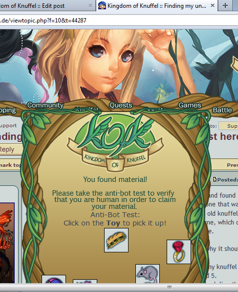
I'm not sure if this was seen or not, so I'll repost just in case.rikuchan wrote:I seem to have run into a slight issue with The placement of the material capcha. It's just a tad low on my screen which causes the lowest icons to be almost hidden.
Re: Layout Change
Posted: Nov 19th, '11, 20:00
by Altira
Firn wrote:For Internet Explorer 9:
Once your browser is open, click the gear at the top right to open the settings menu. Then, select Safety and Delete Browsing History... Or, optionally you may simply press Ctrl-Shift-Delete to open the Delete Browsing History window.
Select Temporary Internet Files. You will also need to uncheck all the other boxes, especially Preserve Favorites website data. This option makes the window also delete objects from websites in your Favorites folder, which is necessary to completely clear your cache.
Click the Delete button near the bottom of the window to perform the operations (i.e. clear your cache by deleting temporary files).
Then restart your browser.
I did it but it has no effect :(
However, it does work fine on Firefox and Google Chrome, so now I use those browsers instead ^^
But aside from the problem with IE, I really love this layout. Everything looks very stylized and I like the green colour and the new logo :3
Re: Layout Change
Posted: Nov 19th, '11, 21:17
by Bononn
i dont know why but i just got this anti bot test :

without marking it you cant really see what it wants you to click on'-'
well not on the first look^^
Re: Layout Change
Posted: Nov 19th, '11, 22:10
by Hikarisoul16
rikuchan wrote:I'm not sure if this was seen or not, so I'll repost just in case.rikuchan wrote:I seem to have run into a slight issue with The placement of the material capcha. It's just a tad low on my screen which causes the lowest icons to be almost hidden.
[Image]
Just wanted to say that this is happening to me too.
I can still see what I have to click, but I'm not sure if it's supposed to look that way.
Re: Layout Change
Posted: Nov 20th, '11, 05:25
by JenessaElfGirl
I love the bright green colors and the new layout. The only thing I'm not really liking is the picture up top of the two girls, gigi and...I forgot the other ones name ^^; but it just doesn't match the rest of the stuff. Also, I kind of liked the avatar where it was before. Now I don't ever look up at it because it's sooooo far away from everything else on the left hand side of the screen, like the avatar buttons and stuff. It kind of looks shoved over into the corner. :( And the butterfly is cool, but I think it should be colorful :3
Re: Layout Change
Posted: Nov 20th, '11, 05:56
by LittleSea
Wowzers!

I like the new color!! Thanks for the update! Also, the butterfly is nice :)
Re: Layout Change
Posted: Nov 20th, '11, 10:19
by Nekomancer
Ah, I like this layout a lot better! Much easier to navigate The colours are really pretty and all too.
The drop down menus are kind of a let down though because neither of the two mobile devices I use display them when I roll over the text. I can't figure out how to get to some places now like the market, art gallery, member list, NPC list, rules, and some other sections. Maybe a tiny link to a site map at the bottom of the page for those of us unable to use the drop down menus?
It is also really hard to keep my cursor inside the tiny drop down section from when I mouse over the 'Help' text to get all the way over to the options without either opening another section or straying too far downwards and it closes.
Have you considered aligning the text (FAQ, Rules, Support Forum) to the right so they are underneath the Help section and easier to click on?

