Page 4 of 22
Re: Layout Change
Posted: Nov 18th, '11, 00:35
by Meepy
It'll take a while to get used to, but I like the colours. :] And the animated butterfly is gorgeous. <3 ( Though maybe a bit distracting? )
Thank you for the new layout! <333
Re: Layout Change
Posted: Nov 18th, '11, 00:35
by Hotaruchan
I really like the new lay-out. But I've to get used to the new link-bar and I'm very bad at getting used to things... Although, I think I'm already getting used to the new links ^^ It's just a little bit confusing...
By the way, I also have the problem that the 'dig here' buttons are gone...
Re: Layout Change
Posted: Nov 18th, '11, 00:36
by kittaly
OMG I LOVE IT!! Personally I think it's much better then the old layout. I love the natural woodsy feel it has now, it's so relaxing and right up my alley, though it will take a little while to get used to seeing my avatar on the opposite side. When I reloaded the market I like "Whoa where's my avatar. Oh there she is." It will also take a little bit to get used to the new menu, but that will come.
Great work Firn!
Re: Layout Change
Posted: Nov 18th, '11, 00:36
by l-lappy
Silverbleed wrote:Only thing I have to get used to most is the avatar position. I don't know if mirroring it is possible, this could suit it better since all avi's now look 'off' the screen, not inside the site. But if it looks incorrect in a mirror vision, just leave that :P
Thats what I think was making me not like the top as much too.

Really love the colours and the butterfly is iee > u <!
Not sure if its a glitch or anything...
when you save your avi,
its doesn't load up the top until you refresh your page or click to get out of your wardrobe.
Re: Layout Change
Posted: Nov 18th, '11, 00:38
by VampMiyu
As much as I loved the previous layouts we've had (I've seen 2 Kofk layout changes as a member), I love this one as well! I think I even like it more than the others =)

the side bar where the fps etc are is beautiful, I missed the old one we had that looked like a paper scroll but this one is gorgeous!!And it replaces it really well! (as the lastest we had was too simple and didn't look like anything).
.
I LOVE that you changed the position of the avie, I think it looks much better on the right, and YAY for removing the frame it had that hided part of it! I found the roses beautiful but they were in the frame too much.
The top menu is beautiful,and the dropdown implementation with the quick links is great! very useful!
I like the new banner, although I have to say it now makes me think of MMORPG banners XD
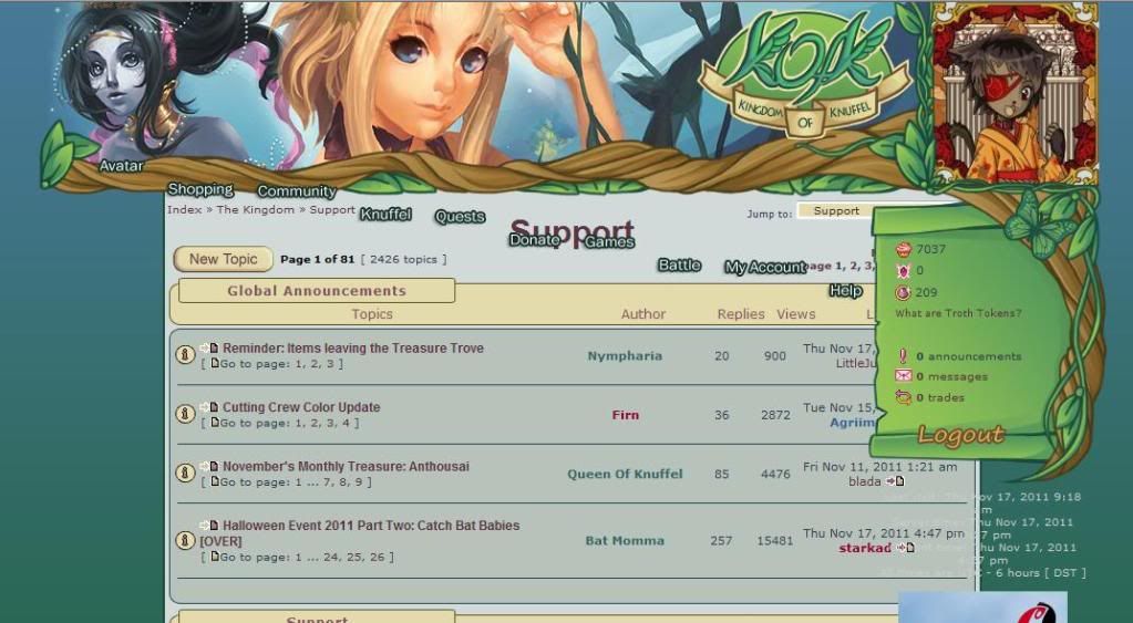
the image on top of the top menu is still the old one, I would simply like to say that as much as that image is beautiful, I really enjoyed an old one there was that if I remember correctly had a castle in it? I think it gave you the feeling on being in the knuffle castle =3 Maybe a new top image should be made, that included more Kofk characters, maybe the Queen and Kind
 OVERALL, YOU HAVE A PLEASED KOFK MEMBER =) so good work, and THANK YOU VERY MUCH ^^
Re: Layout Change
Posted: Nov 18th, '11, 00:38
by noxlock-d
I think the new color scheme is lovely. ^-^ The nav is gonna take some time to get used to but I don't mind. Just something that puts me off a bit is the hard edge of my avatar image rather than a little extended site border around it to blend it in with the layout a little more. Love the cute animated butterfly!
Re: Layout Change
Posted: Nov 18th, '11, 00:39
by MiSssi
Firn wrote:Bononn wrote:But..what i do not like is that the background from the posts in forum are still gray..
I agree, but you cannot really do much with post backgrounds, because you could not read the text anymore with most darker colors. It's either light blue (what you describe as gray) or white or any shade similar to that. ;_; Imagine this text on dark turquoise, blue or green? Not readable anymore. ;_;
But couldn't you make the boxes shades of green and the text a brown ? Just an idea , although I realise it takes time and you are pretty busy with the site and RL
Re: Layout Change
Posted: Nov 18th, '11, 00:40
by Koukai Shi
I love the design of the new layout!!
That being said, it DOES create some problems for me. Most notably is the overlapping issue I'm currently having, which prevents me from clicking on some links, including the 'reply' button in my pm's.
This is how it looks for me.I already did the hard refresh, is there anything else I can do?
Re: Layout Change
Posted: Nov 18th, '11, 00:41
by Ichinya
New layout looks really nice :D It's so green xD
I love this little butterfly under my avi ;p
Now it's looks like a forest magic forum for fairies <haha>
I go and start exploring <jump to other Kofk-place>
Re: Layout Change
Posted: Nov 18th, '11, 00:41
by Jill Valentine
firn ty for the great update!!!! i love more kofk
