Page 7 of 22
Re: Layout Change
Posted: Nov 18th, '11, 01:06
by Koukai Shi
Firn wrote:Koukai Shi wrote:I love the design of the new layout!!
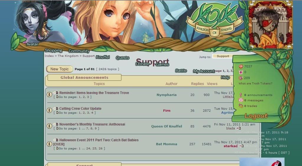
That being said, it DOES create some problems for me. Most notably is the overlapping issue I'm currently having, which prevents me from clicking on some links, including the 'reply' button in my pm's.
This is how it looks for me.I already did the hard refresh, is there anything else I can do?
Oh, it really should not look like this. Have you tried clearing your cache and restarting your browser?
I just finished clearing out EVERYTHING, and restarted the browser twice. No change. Since another person said I should mention it, I'm using Internet Explorer, with a 13 inch (32cm) screen.
Re: Layout Change
Posted: Nov 18th, '11, 01:08
by loonaboo
Thankyou Firn :) your absolutely wonderful  I actually like the colors alot better now and the butterfly that flaps its wings! so beautiful and creative! :D I admit the roses were nice, but this is stunning.
Thankyou for the hard work you put into the new logo, the drop down bar, the PROFILE button!!! and just how much easier everything is sorted!
(I even prefer the avatar being on the opposite side since it looks easier to see now)
I'm proud to be a member of kofk and I hope this is easier on the servers as well :)
Re: Layout Change
Posted: Nov 18th, '11, 01:08
by starkad
Koukai Shi wrote:Firn wrote:Koukai Shi wrote:I love the design of the new layout!!
That being said, it DOES create some problems for me. Most notably is the overlapping issue I'm currently having, which prevents me from clicking on some links, including the 'reply' button in my pm's.
This is how it looks for me.I already did the hard refresh, is there anything else I can do?
Oh, it really should not look like this. Have you tried clearing your cache and restarting your browser?
I just finished clearing out EVERYTHING, and restarted the browser twice. No change. Since another person said I should mention it, I'm using Internet Explorer, with a 13 inch (32cm) screen.
Doesn't happen in my IE... also tried it in a smaller window, and here the page is squeezed without overlapping...?
Re: Layout Change
Posted: Nov 18th, '11, 01:11
by TimTam
Level bar in sig images isn't aligned:

Re: Layout Change
Posted: Nov 18th, '11, 01:15
by starkad
TimTam wrote:Level bar in sig images isn't aligned:
Should be fixed now.
Re: Layout Change
Posted: Nov 18th, '11, 01:16
by TimTam
It is indeed. Thank you, sir!
 *Starkad's knuffel names crack me up*
Re: Layout Change
Posted: Nov 18th, '11, 01:17
by kittaly
OMG I didn't even realize the Knuffle badges changed too, otherwise I would have said something in my fist post. 
I love them too, really I do. Normally I'm not one for change, but this is all just so awesome.
Again, great work it's all beautiful.
Re: Layout Change
Posted: Nov 18th, '11, 01:20
by Firn
Okay, it's past midnight here and we will call it quits for tonight. All other possible error fixing will have to wait till tomorrow.
Re: Layout Change
Posted: Nov 18th, '11, 01:21
by Wren_Fritsche
I love the change it was definitely needed. I especially love that our Avatar is over our stats. I love the fact that our avatar can be fully viewed and not blocked by roses. *nudges Shi-kun* You can use the leaf dragon now! and the head won't be chopped off by roses.
Re: Layout Change
Posted: Nov 18th, '11, 01:22
by Lilandra
Sleep well, Firn & starkad, and thanks for all the hard work! <3